Bye to Google+ Bar or Sandbar Replaced With Brand New Google+ Menu!
If you have used any of the Google products then you must have seen or used the Google+ bar a.k.a Google+ sandbar. It is the dark grey bar that you see pretty much top of any of google’s products (search, gmail, docs, etc).
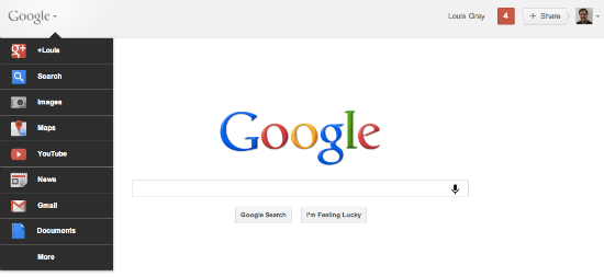
As part of the next level of re-design and to save highly visible space on the top, old Google+ bar is bye bye gone and replaced with new OS like Google+ menu (still the top panel referred as Google+ bar, a light grey bar in the same level as Google’s logo and launched by clicking drop down icon next to the google logo), a google search box, google+ notifications, google+ share button followed by your profile picture. Drop down next to profile picture will take you to your account settings.
It is really cool, easy to use and saves some valuable space on the top.
New Google+ menu on google search page
New Google+ menu with search, share and notifications on top of other Google products
Quick video showing the new Google+ bar
We haven’t noticed changes to our accounts yet and it’s still showing the old Google+ bar. At this time no time frame was given by google of when this change will be seen across the board. If you see change in your account, please share through comments below.


+ There are no comments
Add yours