Google Adsense Home Page Tab Gets a Make Over!
Google Adsense home page tab for desktop/web gets a make over and sports a whole new informative look.
This change is primarily focused on to help improve and keep the focus on day-to-day information for adsense publishers.
Adsense Home Page New Look
Here is the official statement about the New Adsense Home Page
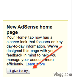
Your ‘Home’ tab now has a cleaner look that focuses on key day-to-day information. We’ve designed this page with your feedback in mind to help you manage your account more efficiently.
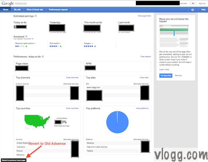
Interested in trying out this new look? Then look for the following notification on the bottom left of your current adsense screen and click on I’ll give it a try button. Don’t worry you can always revert back to your old adsense interface anytime. Just look for Revert to previous home page link in the new interface (refer the first image above).
Today’s change only affects the Home tab and rest of the tabs My Ads, Allow & block ads and Performance Reports remain the same as before.
I personally welcome this change and feel this new layout is very informative. This new layout quickly gives a daily glance of what’s going with Adsense in terms of earnings and other metrics.
Check it out and share your thoughts through Google+ comments below, Enjoy!


+ There are no comments
Add yours