
Google+ Whitespace : Is It Really a Big Deal?
Google+ released its updated and brand new look few days ago. The change was welcomed by the google+ community and was well received. We even ran a redesign poll and majority of users responded in favor of the redesign.
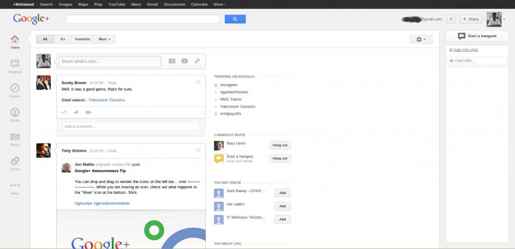
However the fluid layout redesign has caused some unhappiness among some google+ users due to the whitespace that appears in between the trending column on the left and the fixed chat column on the right. You wont see or experience whitespace unless you are using a high resolution screen or monitor.

Google+ with whitespace on high resolution monitors
So we digged into it to actually see what is the percentage of browser users with higher resolution monitors. It turns out that only around 12% of web users are with high resolution monitors which means majority of the google+ users wont even see the whitespace (won’t even know about it). Probably that is why google+ team might have gone with the decision.
Here is the latest March 2012, browser screen resolution market share

Browser screen resolutions as of march 2012 (courtesy: w3counter.com)
We talked to few users with high resolution monitors and they responded not too worried about the whitespace. But they mentioned it might take a while to get adjusted to the new design especially reading the stream from the left (it used to be centered before).
Some issues that require attention
- Graying out of comments is bothering and not easy to read and hard on eyes. Old style looked better.
- Navigation buttons or application button on the left looks disabled unless you hover over them (some people think it is disabled and trying to figure out how to enable them).
- Hover cards used to show the tag line and it was well received. Now it shows location and employer not welcomed by the majority of users.
+ There are no comments
Add yours