Google+ Comments Font Is Updated With a New Darker Color (Previous Redesign Made Is Lighter)
After the recent Google+ redesign and major UI overhaul one of the things we kept hearing for G+ users was the font color in comments was too light and unreadable.
We have also highlighted some of the problems after the major redesign (font color was one among them).
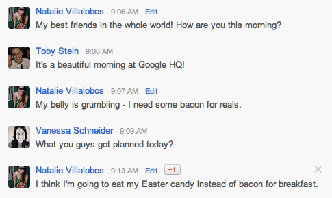
The good news is they have listened and updated with a darker font color (refer image below).
This change makes it beautiful and easily readable. Thanks for listening Google+ team.

+ There are no comments
Add yours