Google+ Hangout Screen Redesigned With New Sidebar, Colorful Notifications and Easy to Find Apps!
It’s no secret that hangouts is one of the most popular feature on Google+ and therefore it gets great attention with new features and makeovers all the time.
Amit Fulay, Google+ hangouts product manager announced the roll out of the following changes in hangouts today(in his own words on Google+)
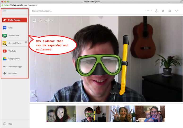
- A sidebar you can show or hide. The most important part of a hangout is the people in the room, so we’ve consolidated important items (like invites, chat, and apps) into a sidebar that’s there when you need it, and tucked away when you don’t.
- Clean, colorful notifications. Alerts now appear in red, actions in blue, and announcements in grey, making it easier to read and respond to notifications while you’re inside the hangout.
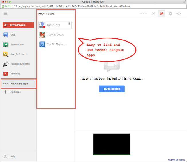
- Apps that are easier to find and manage. The sidebar contains your frequently used apps, as well as other ones active in the hangout. And you can also remove apps from the sidebar at any time.
Google+ hangouts new sidebar (expanded)
Sidebar Collapsed
Alerts and notifications in different colors
Recent hangouts apps
Not seeing the change yet? Don’t worry. They are in the process of rolling out and it might take a while before it appears for all google+ accounts (they got over 400 million+ users to rollout). Enjoy!


+ There are no comments
Add yours