Google Reader With Google+ Integration Released, Now Sharing With Circles Just a Step Away!!
We’ve mentioned earlier about the upcoming changes to google reader and google+ integration. As announced, today google reader team has shipped the shiny new looking reader.
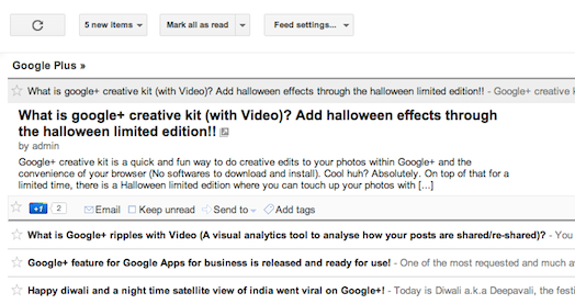
The new google reader with google+ integration is looking inline with other google products that have already undergone design and user interface changes (refer screen shot below).
New features or improvements
- A clean design that resembles design changes in other google products (for e.g gmail)
- Performance improvement with faster loading
- A +1 button at the bottom of every post
- Hovering over the +1 button provides option to post to Google+ (Share on Google+)
- Use the above option to share with the public, friends, family or with your circles with the convenience of being within Google+ (Earlier you need to use our google+ google reader hack to do this)
Features discontinued or removed
- Friending is gone (This is already available through Google+ else would be a duplicate feature)
- Following is gone (same as above)
- Comments is gone (now you can use google+ comments to achieve the same)
- Shared Items is removed
- Like is gone too (+1 serve’s the same purpose)
According to the reader team blog, changes are being enabled in stages. So, if you don’t see the changes please wait for a while before being rolled out to your account. Since changes already been rolled out on our account so far we are positive and liked it.
However we understand that everyone is different : changes we like necessarily doesn’t mean others have to like it. So, please feel free to share your thoughts/comments through the comments section below.


+ There are no comments
Add yours