How to Switch Google+ From Multiple Column to Single Column Layout?
Google+ switched to a default multi-column layout for the posts stream during their last major update announced during Google I/O 2013.
This layout (aka fluid layout) eliminates white spaces and shows posts as multiple columns (in a card format) and takes advantage of your screen resolution.
However for a lot of people this is not convincing. For them reading vertically is easier than reading across the screen row by row.
Luckily Google+ supports switching from multiple column layout to a single column layout (and vice versa) with the click of a button.
Configuring Google+ Stream Layout
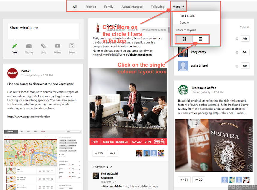
1. Click on More option(with a down arrow) in the circles tab (refer image above)
2. In the appearing menu, Look for Stream Layout option in the bottom of the menu
3. Click on the second option i.e the single layout icon
4. Reverse the above step to switch from Single Column to Multiple Column Layout.
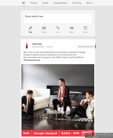
Stream Output in Single Column Mode
Enjoy!


+ There are no comments
Add yours