Google+ Menu Dropped and New Revamped Google+ Black Bar Is Back!
Sometime back we wrote about the launch of a new Google+ menu that was suppose to replace Google+ black bar.
Although the new Google+ menu was looking aesthetically beautiful, not everyone was happy about the change. The reason was, some preferred bar over the menu, some felt it takes a extra step to reach out to other google products or services, etc.
People have submitted feedback about menu change and Google has listened and taken action on it. A win for people who preferred Google+ bar over Google+ menu. (A loss for those who loved the new menu style interface. It took a while to roll out menu changes to everyone but people took extra effort like altering cookies, install extensions to get the menu interface.)
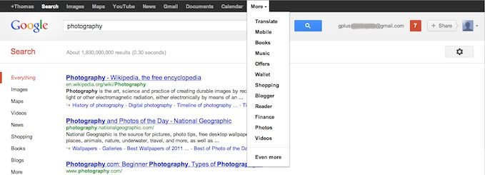
Now officially the menu interface is gone and bringing back the black bar with visual improvements as well as with some features that were part of the menu interface.
Google+ black bar
- Menu replaced with revamped and space padded black bar
- Google+ share button, profile picture and notification button on the right stays (from menu interface)
- Search box appears in the middle
