All New Google+ Feedback (Aka Google Feedback) With Wizard and Screenshot Preview Released!
Since the release of Google+ social network, you might have noticed or even used the Send feedback button on the bottom left of the Google+ main stream page. Now that feedback tool has gone through a major upgrade and has been improved with better features.
Google+ feedback update
Google+ has improved and grown by listening to users feedback right from the beginning. Send feedback tool has played a key role in gathering new ideas, thoughts, feedbacks and issues straight from G+ users.
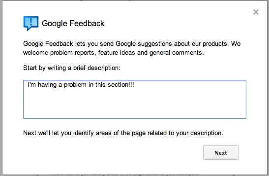
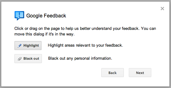
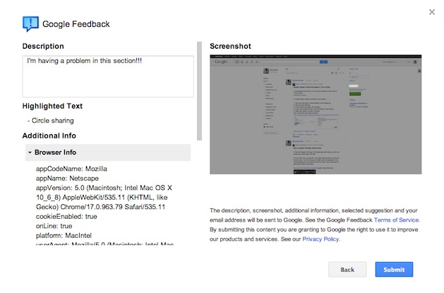
Prior to this change, feedback tool was a very simple basic form. Now it has been improved to a wizard interface with each step being detailed with what’s being collected, a screenshot and a quick preview of what’s being sent before providing the option to submit it to Google. A great improvement in collecting feedback.
New Google+ feedback dialog
Highlight / Blackout option
Highlighting a section
Feedback preview with screenshot
Having a issue with Google+ or have an idea that could improve Google+? Just click on the Send feedback button and share with the Google+ team.


+ There are no comments
Add yours