Google+ Gets a Major UI Overhaul, Clean and Crisp : Is Google+ Precursor for the Next Web Operating System?
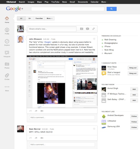
Like many of us, if you have logged into Google+ today, you may have been greeted with a great surprise. A major UI(user interface) overhaul with a brand new look and feel that looks similar to an operating system.
Google+ new look and feel
This is a major user interface and user experience redesign since the launch of Google+ in july 2011.
New Features
- Hangouts directory : Click on the Hangouts icon on the left navigation bar and you’ll find list of public hangouts that are happening now. Click on Hangout button to join any of those hangouts
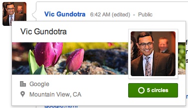
- A new and beautiful user flyover card
- Google+ pages and games are now organized under More section of the navigation bar
- A new section called Explore has been added to find trending topics, what’s hot on Google+, etc.,
- Google+ chat is nicely laid out on extreme right column of your G+ interface
Overall the new look is beautiful with absolutely no clutter and and it’s clean & crisp. But it might take a little while for G+ users to adjust and learn the new layout (especially in large or high resolution screens) since now you have to look / read content by moving your eyeballs towards the left (previously it used to be in the center).
Another thing we noticed is, the new look and feel looks similar to ubuntu linux unity interface. Is this a precursor for a google powered web operating system? Remember the introduction of hangout apps released a short while ago? Throw in email and google search you pretty much have everything you use everyday as a web user.
Looking at comments from G+ users and our own view, the new redesign is met with a warm welcome from general users. But however it has caused some discomfort among developers especially from those who wrote chrome extensions to add additional functionalities to G+.
This new layout has absolutely broken their extensions and made it unusable until they fix it. The larger frustration was they were given no prior warnings or notice that this is coming. But given the fact that Google+ is relatively new and in beta stage changes are highly likely to be expected.
On the other hand this could have done better from Google+ team by giving an early notice at least for the developer community. Remember developers are the biggest advocate for google and it’s products. Hope this is done better in the future.
Google+ new look highlights video


+ There are no comments
Add yours