Google+ Android App Version 2.6 Released With Brand New Look and Experience
Few days ago google+ iphone app released with a major UI overhaul and new features. Yesterday they have released version 2.6.0.30400255 of the android app with similar features.
Do we need a voice plan anymore? newly designed Google+ android app let’s you to start a hangout right from your mobile phone and rings people you have invited to the hangout. If they missed the ring they can always join back later (make sure your phone has a front facing camera to start a hangout).
Gorgeously designed incoming stream of posts that lets to go through posts like viewing a gallery. One problem we found was it is kind of hard to figure out where each post ends i.e the separator. Although it gives a seamless experience of browsing through posts, they should improve the separator between posts.
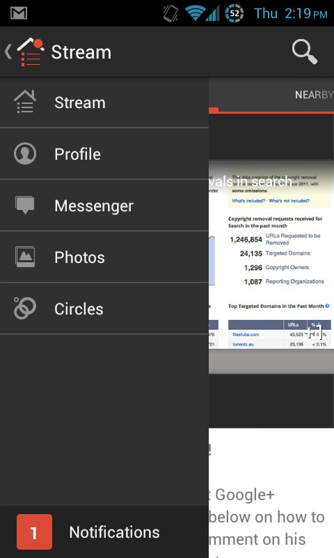
The old boring icons of launching features in the application is gone and replaced with a nice navigation ribbon (refer image above) that allows to quickly navigate to stream, profile, messenger, photos and circles.
New features
- Start a hangout right from your phone
- Fine control of instant upload settings
- Newly designed navigation ribbon
- It is fast and very responsive
- Ability to download photos and turn into wallpaper
- Edit posts inline
- and many more
The new google+ android app is readily available for download on android play store or just update if you have already installed.
- Main stream in android app
- Communication and notification settings
- Instant upload settings
- Newly designed navigation ribbon in google+ android app
- What’s hot stream in android app
- Incoming stream from All Circles


+ There are no comments
Add yours